Showing posts with label oil painitng. Show all posts

Monday, November 17, 2014

Fill in the Blank

The more I think about it, the more it seems to me that great art reflects a profound moment of insight into human life. I realize that , depending on your orientation, that may sound totally cliched and wooden, or far too abstract/ivory tower (or just plain too obvious to need stating), but stay with me.

I've recently had the good fortune to see three fantastic artist retrospectives in the past few months - Turner (and the Sea) at the Peabody Essex Museum, M.C. Escher at the Currier Museum in Manchester NH, and Goya at the MFA (the latter two are still up, you should go if you can, and there's a third - Calder - in place of Turner at the PEM). 

Turner, Venice, the Bridge of Sighs, exhibited 1840

They weren't billed as retrospectives but they all surveyed decades of work to trace important developments throughout the artist's career. Each experience (and they were Experiences) reinforced a growing realization: being an artist means gathering up the necessary tools and immediately turning to the work of expressing one's personal view of life. Great art conveys deeply felt ideas about being human, as discovered and embodied in authentic revelations and epiphanies that emerge directly from a life lived within devotion to an artistic practice.

Tracks, MC Escher, 1952

Note "that emerge directly" from the artist's life. This means that while it's essential to immerse oneself in the past and present history of art, one refuses to adopt a second-hand mythology. The images in the work have to come spontaneously from making the work and directly from life experience (though the latter can and should include the experience of great art).

Goya, Yard with Lunatics, 1793-1794,

Unless they're prodigies and effortlessly and rapidly master the tricky business of learning to paint, very few artists ever reach the stage I'm talking about. But I think the reason has less to do with native ability than with intention. There's an awful lot to think about just trying to get something halfway decent from the paint tubes onto the canvas. The way to learn is to study the ways and means of the masters and others whose work you respond to. But to do so is necessarily to take on another's vision as well. And here I'm just talking about technique! The matter of making something meaningful is something else.

Alexander Calder, The Star, 1960

Personally, I've realized that it's admiration for the great works that inspires me to paint  - but it's attention to the craft that continues to dominate my practice. In other words, when I approach a canvas I'm often thinking about things like design, color, and value - or, a step above that, rhythm, feeling, and expression - all of which is exciting and motivating and as likely as not to result in a "keeper." But this I think is why they say one must "learn the rules and forget them" in order to do anything worthwhile - there's so much going on in the act of creation itself.

But when do we finally know enough of the rules to really begin? Naturally, some artists just go on learning and practicing the rules all their lives, producing gorgeous work that sells a ton, never feeling the need to get more than a rumor of meaning into the work. The latter is left for the gods of art. But it seems to me that not losing sight of art's true purpose (to express profound truths about humanity) can't help but make us all better and more earnest painters.

This week I'm going to challenge my weekly studio class to a "fill in the blank" exercise. They're to bring an image to class of a painting that moves them and write a short paragraph or two about it in which they complete the phrase, "this painting expresses the ___________ of life." 

To account for paradox and complexity  there need not be only one word in the blank. For example, I might say that the Calder above expresses both whimsy and the precarious balance of life - I'm seeing this in the amorphous black void on the left opposed to the golden red star on the right and the playfully organic, leaflike shapes, both living (red) and dead (black) that punctuate the spaces between and around them. That's just me, of course, and that's fine. My interpretation tells me as much or more about myself and my concerns as a painter as it does about the work I'm responding to. 

And of course I expect there will be as many visions of life as there are painters and paintings - after all, everyone sees life a little differently from everybody else, no? My theory is that it will tell each of my students a little about why they desire to paint and what might be a fruitful (because personal and thus genuine) direction worth pursuing in their art.

I invite you, given a favorite painting of your own, to try this at home. Surely at least thinking along these lines once in a while can't hurt us mortals of the brush.

Monday, October 27, 2014

Caput Mortuum

With All Hallow's Eve nigh upon us, I'm taking a minute to salute a peculiar color with semi-macabre overtones, a pigment I delight in using called "caput mortuum."

caput mortuum
(Other terms for this pigment are cardinal purple and Mars violet)

The translation of the latin caput mortuum is literally "dead head," or "death's head," a term for the symbolic drawing of a skull (hence the famous Death's Head Moth).

The Death's Head Moth. Why have you gone so silent, my Little Lamb?

(Fun fact: I used to think the word "kaput," meaning broken down or dead, came from "caput" but apparently not. Autocorrect nonetheless insists upon a link between them...)

The term caput mortuum comes from alchemy, where it was used to denote the residue at the bottom of a heating flask after the solution's "nobler" elements had "sublimated." (Alchemists thought in symbolic terms, so it's a metaphor for how the soul was thought to ascend into the Aether after death, leaving the body's material remains behind). The alchemical symbol for the discarded residuum was a death's head, a version of which remained in use by chemists through the eighteenth century.

Symbol for caput mortuum (bottom right) from a ms. by Isaac Newton.
It's made from hematite, the common name of which is "blood ore," a form of iron oxide (rust is also a form of iron oxide, and incidentally, transparent red iron oxide is another color in my box).

Hematite (Blood Ore)
Painters used a version of caput mortuum as a substitute for mummy brown. If you've ever seen a real mummy, you may have noted the intriguing ochre and other warm earth tones of the ancient wrappings; Mummy brown was a pigment made from ground-up bits of mummies, both humans and cats. Artists stopped using it once they learned what was in it! Here's a painting that uses it extensively. Color look familiar, museum goers?

Interior of a kitchen by Martin Drolling, a painting made almost entirely of the pulverized remains of dead Egyptians.
Several brands of caput mortuum can be found, but I stopped at the first one I tried: Old Holland. I love how Old Holland colors mix - they make the most sumptuous and complex grays - and caput is one of the less expensive pigments (around $10 for a regular 40 ml tube). It's so packed with pigment that a single small tube can last me about a year.

Out of the tube, the paint looks the color of dried blood. But mixed with white it becomes a beautiful, moody shade of rose-violet
Caput mortuum mixed with WN's Soft Mixing White
and mixed with almost any blue, it makes the most gorgeous violets and mauves.

Caput mortuum mixed with mixed with WN's Ultramarine Blue and Soft Mixing White
It mixes beautifully with anything, actually, but I'm especially fond of blending it into a warm white (a Titanium/Zinc plus Yellow Ochre, say, or Old Holland's Brilliant Yellow). I love the harmonious contrast between the resulting yellowish-pink in proximity to the mauves and violets you get from mixing it with blue.

Closeup of a painting of mine using various mixtures employing caput mortuum
On a related note, I stumbled upon this mixing chart some guy made using Anders Zorn's very limited (three colors!!) palette (ivory black, cadmium red deep, and yellow ochre + white used as a value-adjuster, not a hue). These can be used to make many gorgeous colors including a variety of Mars violet-like tones.

Just a fraction of what ivory black, cad red deep, and yellow ochre can do together.

Ridonculous Anders Zorn painting presumably done with just the three colors above, Sommerabend, 1894

 Incidentally, Zorn's palette forms the basis of celebrated landscapist Scott Christensen's work.

Christensen rocking the Zorn palette with the addition of ultramarine blue.
There's a lot of caput-color in this, though I don't think he uses the pigment. One of the best things about oil painting has got to be the alchemy of mixing colors.

An artist mixing colors in his studio.


Thursday, March 18, 2010

"Old Master" Orange


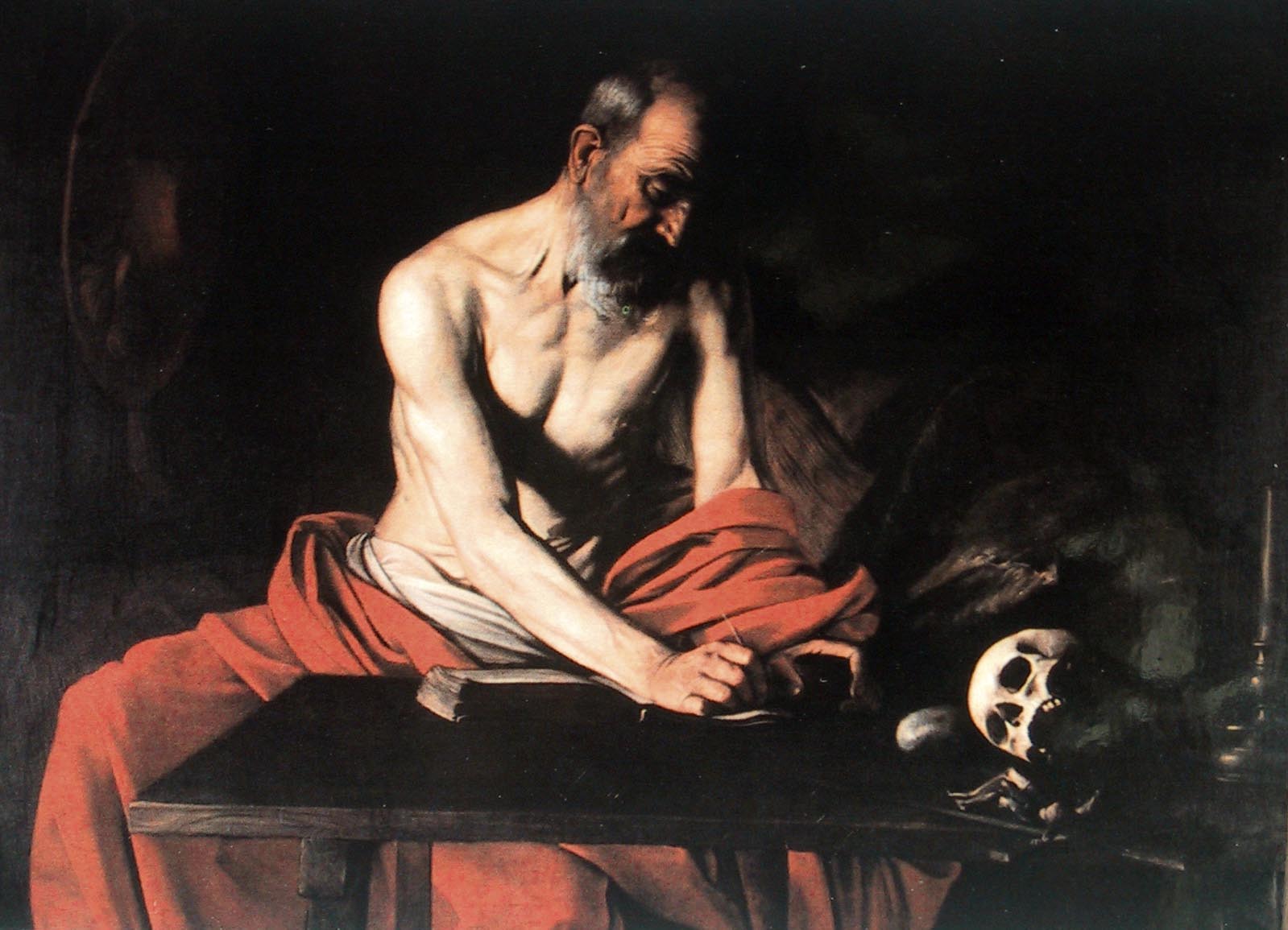
I've been loving studying "old master" techniques using still life subjects. I'm using a limited palette, in this case to create a Caravaggio-like "tenebrism" - i.e., dark, almost featureless backgrounds with highly contrasting, strongly directional lighting of the main subject. Applying several glazes of translucent paint layers lets me build up a glossy surface into which light passes and bounces back out, creating a luminosity that seems to come from within the painting. This luminosity is one of the advantages of using oils, so I figure might as well take the time to do it and let the medium be its best self once in a while.

I've done apples, pears, grapes, and lemons using these techniques. This particular still life is 4x6. It's a commission, along with a matching pear that I'll be starting on next. I love doing these! When they work, it's like a spiritual experience of a little piece of nature fixed inside a frame. I will probably be doing these for the rest of my life.