Sunday, March 23, 2014

Sequencing: A Creative Exercise for Oils

The River Gallery School sells a booklet on the process for $15.
A couple of weeks ago I plunged into a painting class while visiting friends in Vermont. I hadn't planned on it, but I enjoyed being the student for a change, and I encountered an exercise called "sequencing" that's great for total beginners and veterans alike.

Workshop leader Lydia Thomson explains the process. "These are oils, and therefore .... they're beautiful," she said.
Developed at Brattleboro's River Gallery School of Art, "sequencing" involves painting three small pieces at once. We made seascapes on card-stock - the cheaper the better, as this is about enjoying the process.

It goes like this: put on latex gloves, scoop up a dollop of cold wax medium, and kneed it into the surface of three small pieces of canva-paper, card stock, or whatever. Start on the left canvas and work to the right, making similar gestures each time.

These three little guys were taped down to the board at the start.

Here's the setup: a stick, a few rags, a razor for scraping off "mistakes," three pieces of card stock taped to a sturdy surface and latex gloves, as your fingers do the painting. The palette consists of a spectrum of paints surrounding two transparent earths and a generous dollop of COLD WAX MEDIUM. We used Dorland's Wax Medium:


Dorland's is wonderful stuff. Cold wax is smooth to the touch, takes paint in a manner that allows good control of layering and blending, and acts as a drying agent to boot. I loved the meditative, tactile experience of physically massaging the lush oil colors into the silky wax medium.

As soon as someone finished a sequence, he or she would tape all three to the wall. Click it to see them up close.

Once you've got wax on all three, you rub on a transparent earth color to tone the wax under-layer, blending until it's covered completely (we used a transparent brown-pink, but you could also use something like transparent oxide, Indian Yellow, or burnt sienna). This, explained workshop leader Lydia Thomson, acts as a metaphor for sunlight (she encouraged us to use all our colors metaphorically rather than literally).

After you've toned the paper, you compose your seascape using whatever colors you feel, working them over and into the wax on each piece, moving from left to right, doing the same thing each time.

At work at the River Gallery school

There's a meditative quality in the repetitive nature of working on the three pieces at once, introducing a color to the first one, then the same color to the second and then the third, and so on, leaving traces of the same gestures on each painting.

It's great for beginners because it involves no solvents, no brushes, no mixing, and minimal mess. Experienced painters will relish it as a reintroduction to the sensuous nature of oil paints and a fertile field for the development of new ideas for larger work.

One of my sequences.

This one had a Richter-like vibe.

Working fast is good. We all had time to make multiple sequences.
This is something we'll be trying with my Tuesday painting workshop in Lowell this week. It's an excellent way of unleashing creativity and a very refreshing way of experiencing oil paint.

Monday, March 17, 2014

Spring Tufts

File under "humble subject matter." One of art's tasks in our time is to reveal beauty in the mundane, to raise the commonplace to the level of the extraordinary. 

I've been struck by the beauty that painters through the ages have wrung from the humble tuft of weedy grass. Once again the lesson is that subject matter may easily be the least important aspect of painting. These paintings portray bits of leaf and stem that people pass hundreds of times without noticing. Art such as this helps to remind us that anything can become the basis for amazing, meaningful art if only it's seen for its expressive potential. 

Here are some anonymous tufts of grass and bracken, a few bare, weedy shoots and branches to remind us that yes, spring really is going to come eventually.

Don't be fooled by the run-of-the-mill plant life in these! These works repay careful consideration and can tell us a lot about design work, compositional choices, the application of the paint, and the evocation of mood, even given the most unremarkable starting-places. Here is proof that the poetic and the sublime need not depend on grandiose or dramatic subject matter.

It ain't what you paint; it's how you see it.

The first three are by contemporary Philly painter Alex Kanevsky. Sorry about the lack of titles- I hope to clothe the naked paintings in them later.


These four are by Leon Bonvin (French, 1834-1866), whom I am tempted to crown "King and Master of the Tuft."


One of the first western artists to elevate the tuft to the level of immortal representation is probably Leonardo, but here's a beautifully realized work by Albrecht Durer to look at instead.

Albrecht Durer, The Large Piece of Turf, 1503
Look how Ivan Shishkin can pull beauty out of the weeds!

Ivan Shishkin

Here'sa typical zen style painting of seemingly random bamboo shoots by Araki Jippo (1872-1944).


Bamboo Shoots, Araki Jippo (1872-1944)


Dennis Miller Bunker gets a shoutout not for painting individual pieces of turf so much as for helping to initiate the painterly attitude toward ordinary scenery still celebrated among plein air painters today.
Dennis Miller Bunker, The Pool, Medfield, 1889

And to bring it back around to the contemporary, I leave you with this one is by Robert Baart and an invitation to participate by drawing my attention to your own favorite paintings of the most commonplace little clumps of natural beauty.

Robert Baart, Water Sedge

Thursday, March 13, 2014

The First Painting I Ever Saw

My parents had a print of a European harbor scene that occupied a place of honor in my boyhood home. It hung over our wooden record cabinet, or “hi-fi” as we called it. 

Although I remember gazing dreamily at the magical world it opened into, I have no idea who painted the original. As closely as I can recall, it looked something like this:


Maybe it was Dutch. All I know is that it had boats with sails, a mist-veiled coast, and a big blowzy sky.

Other than that print and the intriguing stained glass windows in Christ Church, Oyster Bay, Long Island, the only other art I saw as a young child was the ceiling mural of the Oyster BayPost Office.

This was really something special. It was, clearly, a real painting (a fresco, actually). It was a work of elegance and imagination. It was really a magical world. And it was on the ceiling!

Arthur Sturges's ceiling mural in the U.S. Post Office, Oyster Bay, Long Island

Funded by the depression government’s Works Project Administration program, “the vaulted ceiling was painted by Peixotto assistant, Arthur Sturges and depicts beautiful women representing different countries sending mail to North America on ships and planes. Mercury, the winged messenger, sits atop the dome to receive the mail with speed.” (Thank you WikiPedia!)
A ceiling that showed the sky! And even gods and goddesses inhabiting what appeared to be Heaven! But these celestial beings were doing things with little ships and planes -  implying that whatever was going on up there had something to do with the modern world we were standing in down here!

Art, then, was a sort of portal to another world that reflected back something about this one. I can still dimly recall the visit on which a grownup (either my mother or my grandmother) first pointed up at it. And now I’m painting skies myself.


New Sky, Oil on Wood, 18"x18," 2011

Plum Island Dusk, Oil on Canvas, 8" x 10," 2010

Plum Island Redux, Oil on Wood, 24" x  36," 2011

One of the secrets of painting effective skies, I think, is to watch what you're doing at the horizon. Blending the lowest, most distant clouds into wisps and streaks of light and color helps provide the sense of receding space. You get the feeling that the clouds highest in the picture are closest, while those furthest away gradually recede along the curvature - the "vaulted ceiling" - of the heavens.

Postscript

At the same post office, there’s an impressive ornamental flagpole base outside with an amusing story that goes with it (see “The Man in the Shed”). At the same time that the murals were done, the WPA sent a little-known immigrant from Bologna, Italy, named Leo Lentelli to produce a series of sculptures here. 


The story goes that once his chunk of granite had been put in place, Leo built a little shed around it. There he worked, shielding himself from the winter winds that rip through my old coastal hometown in the winter. Thanks Leo - you rule.

Sunday, March 2, 2014

Painting a Sensation

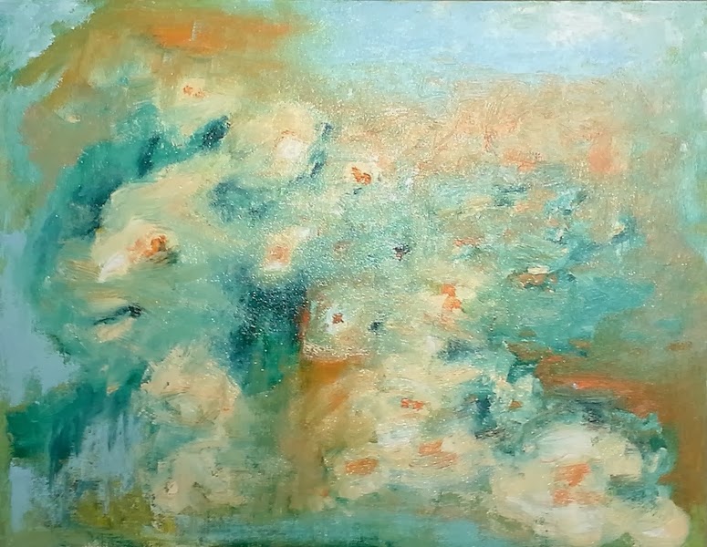
This week in my weekly painting workshop in Lowell we set ourselves the task of painting the sensation of flowers - we were to paint not the flowers themselves but the feeling of looking at them. I did a quick demo to show some strategies for painting abstractly.


My abstract floral demo

It didn't come out nearly as "flowery" as I intended, partly because I didn't mix all of my colors as judiciously as I should have. Nonetheless, the point was made. 

Next I asked everyone to take a minute to search their memories for a time when they were moved by looking at flowers - a garden with some special significance, perhaps, or that moment when you lean in to a flower to smell its fragrance and can almost feel the colors washing over your face. 

Then they mixed colors corresponding with that sensation and began placing them on the canvas according to a few stated formal principles of composition, principally "variety within unity."

They were all game for the experiment, brave souls! And much fine work was completed and many lessons learned. Every painting was, of course, different because each was so unique to the artist. 

Abstract floral by Cynthia DeSando

Garden, by Bill Reedy

After we tried flipping it, Bill thought this resembled clematis or another vine flower. I like it in both its vertical and horizontal orienations.

Abstract floral by JoLynne Murphy
Abstract Impressionist Flowers by Suzanne Hodge

The exercise also allowed everyone to concentrate on principles of design and pictorial organization (both intuitive and otherwise). It also offered a chance to explore the emotive properties of color and the "plastic" qualities of the paint itself- different ways to apply it using various brushes and other tools.Altogether it was great exercise. They all succeeded in using paint to tap into lived experience and personal sensations (rather than sitting down in front of something and trying to represent it relatively objectively). 

It's a great feeling to essentially make something out of nothing - to compose from personal experience is surely one of the essential aspects of the creation of meaningful art.

Monday, February 17, 2014

Abstract Musings

Tomorrow evening in my weekly Tuesday evening painting workshop we’ll be pushing paint around with the goal of creating what I'd like to call delocalized beauty. 

Delocalized (adj.): 1. To remove from a native or usual locality; 2. To broaden the range or scope of.

Modern art generally dispenses with the conventionally beautiful as unreal, uncourageous, outdated, superficial, sentimental, and an impediment to doing what modern art is supposed to do: Wake people up. Beauty as Western art has known it flees from tough-guy talk like that.

So we'll use a floral theme to try to get the jump on it.  We are going to let go of figuration (the element of image) and paint the feeling of appreciating flowers rather than painting the flowers themselves. 

My own abstract floral, "All the Sweet Tints," a 14" x 30 " floral abstract (the allusion is to a garden, actually)

“I want to express my feelings rather than illustrate them," said Jackson Pollock.

Is abstract art, then, about feeling? Were the abstract expressionists like Pollock just painting their feelings? No, they were also hurling themselves against a wall that Pablo Picasso had built right in middle of Western Art. After Cubism, where could "important" painting go? 

Jackson Pollock, Mural, 1943

They discovered new territories and how to get there; their work further widened the definition of art's possibilities, insisting, like the Cubists and the post-Impressionists and the Impressionists before them, that art could and should accommodate more than the conventionally beautiful and the serene, making room for big ideas about civilization, time, eternity, powerful forces of natural energy, and the relationship between the human psyche and the universe at large. Most art history books talk about all this in terms of the formal pictorial elements and the history of Western art, giving ordinary viewers of art very little to go on. 

The Swan, Ryan Cobourn, from a series incorporating classical mythology
How can we, tomorrow night, credibly present the feeling of seeing flowers without painting the flowers? 

I like Brooklyn painter Ryan Cobourn's answer. In this essay/interview he discusses the WHY of what he does and also incidentally hints at the how (I think you learn more from getting the "why" of what artists do than you do from the "how" in any case.)

I like what he says about illusionistic painting (realism) vs. what he does when he removes the representational image but leaves in shapes and colors that, to him, are associated with and suggest - allude to - the subject.


"In abstract painting you don’t have illusion—like illusion of space—but you have allusion. Allusion is way more interesting to me than anything else.” - Ryan Cobourn

This distinction strikes me as analogous to that between prose (illusion) and poetry (allusion). It’s what I like about Eric Aho’s recent landscapes too.

For me, paintings like these have an extra dimension of pathos and significance; because of how they're painted, they also allude to the act of painting itself - the very human need to explore perception and our relationship to nature by scratching our little images out on the wall of history.

I also think the work of a different Ryan, Ryan Coleman, has something relevant to say about our purposes this week (abstraction with floral motif). 


Season of Light, Ryan Coleman

Untitled (Commission for the Ritz-Carleton Wash. D.C.)
This painterly work is lush with the colors, textures, and above all the feelings associated with flowers and plant life - all without painting an image of a single leaf or petal. 

Perhaps you think some of this contemporary work doesn’t get much beyond the "Ab/Ex" guys, de Kooning, Pollock or Frankenthaller… 


.... should that matter? No, you say? Perhaps you’re very right. Just as it wouldn't matter if you're painting landscapes and not "going beyond" Aldro Hibbard. Yet, this was very important to the Ab/Ex guys - they did what they did specifically to "get beyond" the precedents set by the artists that immediately preceded them. Can we have it both ways?

To me, most of these paintings work just as well as much of what I see out there and in many cases much better. What do you think? 

Ryan Coleman, Limey
A lot of people, even painters, look at art like this and, because it puzzles them since it doesn't look like or do what they assume art is supposed to, they say “meh - my kid could do that.” But painting effective abstract art is probably more difficult than painting realistically; it demands that the artist approach all of the basic tools and techniques of painting with a super high degree of knowledge and sensitivity to their inherent properties and their raw emotional value.

At any rate, learning something of the language of abstraction cannot but help you as a painter, for I firmly believe you DO need both, the language of realism and that of abstraction, in your toolbox.

I also believe it’s not that some folks just “know what they like,” as they say, but rather that, in many cases, they really just like what they know. The general public didn’t really understand or like the French Impressionists as they do now until after at least 1950. By analogy, that would put the beginning of mainstream appreciation for abstract expressionism at about 2035. I'm convinced that we're well on our way.

Ryan Coleman

Thursday, February 6, 2014

New Addition to My Studio

I just added this great new palette to my studio.


I know, it's not the tools but how you use them. Still, I have to speak up for the virtues of a "real" palette (as opposed to the standard oval art-supply type). 


The Mighty Palette, reposing atop an also newly acquired marble side-table.

I purchased this one, (branded by Richeson) for $20 at Van Gogh's Gear, my local, independently owned art supply store after one of my students walked in with one. Utrecht sells them and Blick too, etc., I'm sure.

What's great about it? It's big. It's like having a lap desk you can hold in your hand. 

You know you want one.

It's also great because it's light (you don't get tired of holding it) yet reinforced at the handle (weighted, actually- however, not quite enough to fully alleviate pressure on the thumb, I'm finding). It curls around your body "ergonomically" when you hold it, and it's slightly concave, which seems to make it easier to manipulate from side to side when reaching for a pool of paint.

Well-dressed Russians know a "real" palette when they see one.

In short, it's been a revelation to me, and it's probably still nothing like the exquisite pear-wood (or some other exotic-sounding hardwood) one sported by the gentleman (Konstantin Makovsky) above.

By the way, as these pics show, it turns out the cutout area near a palette's thumb hole isn't primarily for gripping; it allows you to hold several brushes at the ready as you work. I can't believe I didn't know this until now.


Most painter friends of mine don't use handheld palettes at all. I understand they're not employed in the vast majority of art schools today (where, apparently, representational painting isn't the first priority, to say the least).

But maybe that's partly because the only ones you ever really see in person are the little ones at places like Michaels and A.C. Moore, which I think are just too small for serious work.


I didn't sand, stain, weight, and seal it like some folks do (though I'm thinking about it). So far, I just anointed it with oil (olive and, as a second thought, linseed) and started using it. Either way, it'll stain itself into a lovely neutral gray-green patina. One of the advantages of wood palettes over glass or plastic is that you may enjoy watching them get better over time.

I guess there are some interesting handheld palette designs out there once you start to look... What do other folks use?


Bring back the full-size artist's palette I say! If all handheld palettes were like the bad boys in these pics, more of us would be using them more often.

Now does anyone know where I can get a 19th century smock like this guy's? Preferably linen, of course.

"Love me, love my smock...... Now go away." - Anders Zorn